Logo
The Logo, a vessel of essence. Empty it of clutter, grant it space to breathe. Let it be seen as it is, not as you wish it to appear. Only then will its true form resonate with the beholder.— Master Algorithma, the Oracle of Design
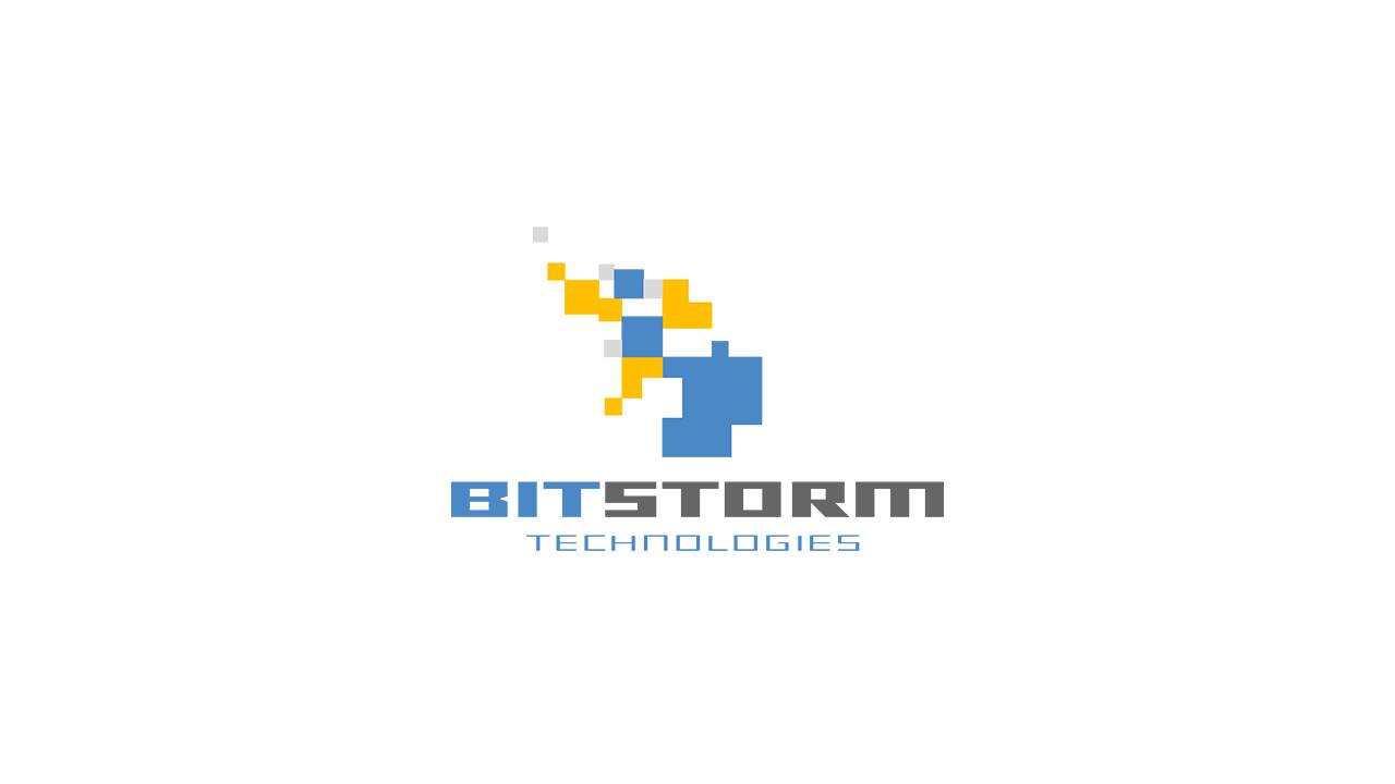
Primary Logo
Our main brand logo. Use this as the default choice for most applications.
BitStorm Pixel
Our iconic mark in its purest form. A pixel-perfect representation of technological precision.
BitFire Amber

The amber variant of our BitFire logo, perfect for high-contrast applications.
BitFire Pixel
A pixel-art inspired version, great for retro or tech-focused contexts.
Horizontal Logo
Optimized for horizontal spaces and header areas.
Shadowed Logo

Enhanced with subtle shadows for depth and dimensionality.
Social Card Logo
Optimized for social media cards and YouTube thumbnails.
Usage Guidelines
Spacing & Sizing
Maintain clear space around the logo equal to the height of the mark. Minimum size should never be smaller than 32px in height for digital applications.
Background Usage
The logo works best on light backgrounds. For dark backgrounds, use the white version or ensure sufficient contrast for readability.
File Formats
Use PNG for digital applications with transparency needs, SVG for scalable web use, and high-resolution PNG for print materials.
Brand Colors
For detailed color specifications and usage guidelines, visit our colors page.